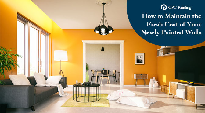
For a successful retail store, there are a variety of details that work, which are the location, furniture, decorative items and its employees. But, one of the most important things that drag the attention of customers is the paint colour. Hence, choosing the right paint colour can put a considerable effect on the business.
Whether it is a boutique, supermarket, departmental store, shopping centre or drugstore- each and every unit must have a chosen colour to express business intention and emit a positive vibe to hit the mind of the customers. So, we are discussing here the significance of each colour for a store –
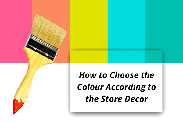
How to Choose the Colour According to the Store Decor:
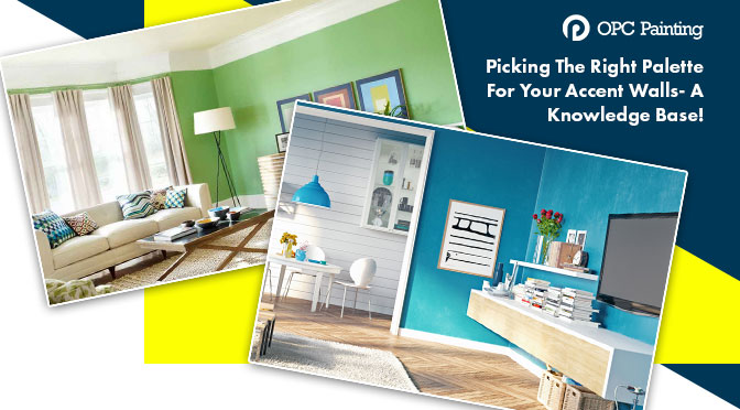
You will need to choose the primary and secondary colours. The primary colours denote the neutral one, and secondary colours signify the bold accent colours. The primary colour should cover 80% of your store, whereas the accent colour should take up 20% of your decor. Moreover, the monochromatic colour scheme uses a single colour in varying shades. We also work on a complementary colour scheme, where the selection of colours is made opposing each other on the colour wheel.
Colour psychology:
While working on store design, you have to choose the power colour for your business that our painting services in Sydney can work for-
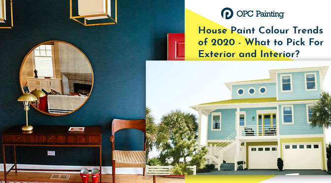
Blue
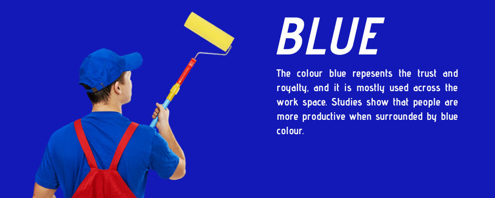
The colour blue repesents the trust and royalty, and it is mostly used across the work space. Studies show that people are more productive when surrounded by blue colour.
Red
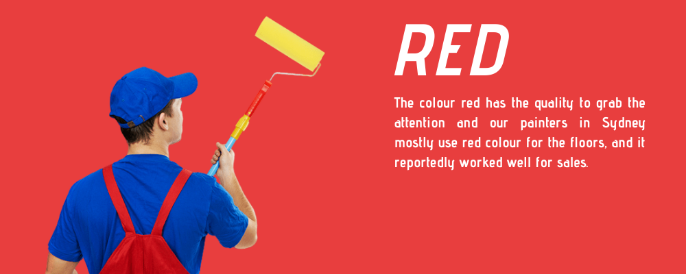
The colour red has the quality to grab the attention and our painters in Sydney mostly use red colour for the floors, and it reportedly worked well for sales.
Yellow
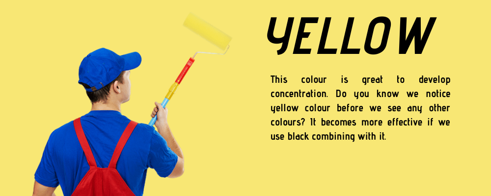
This colour is great to develop concentration. Do you know we notice yellow colour before we see any other colours? It becomes more effective if we use black combining with it.
Green
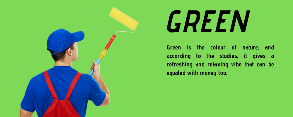
Green is the colour of nature, and according to the studies, it gives a refreshing and relaxing vibe that can be equated with money too.
Pink
The colour denotes light-hearted, romantic and happy feel. The colour itself is the soothing one and can effectively drain the day-to-day negative energy you gather inside, from people opposing you. So, having a store painted pink by our commercial painters in Sydney can give your customers the purpose or interest to try something new.
Orange
It’s a happy colour that denotes energy and enthusiasm. Hence, our commercial painters Sydney suggest retail shop owners put a positive effect on people. So, painting your shop front with orange can make your customers feel good.
Brown
It signifies warmth and security. Even, many retail stores use various shades of brown in leather and wood.
White
Nothing can beat the clean and bright charm of white interior painting in Sydney. Even, a few designer stores have been seen painted entirely with white.
So, it was the explained significance of each colour. At the end of the day, two things matter- make shoppers feel comfortable entering the store and let the merchandise shine. The colour scheme must compliment your space and enhance brand identity. Call 0424 845 188 to hire our professionals today and get your retail store painted.